This is how web pages that work are built. Optimize yours
Although it may not seem like it, some pages of your website are more important than others, as they deliver information of fundamental value to the customer. While each site is different, the standard remains.
Sure, when you hear about optimization, the first thing that comes to mind is SEO, and that’s fine. Nevertheless; The type of optimization that we will cover here will be useful for you to create pages based on the needs of your users.
So how to do it? The model is exactly the same for each of them. Start by asking yourself: “What is my user looking for?”. Find out the reason why they are navigating to that page, if they came from a search engine or if they came to your site through a navigation menu.
Also discuss what you need to know and, if possible, provide as much detail as necessary. The more specific you are, the more likely your users will remember the information they find there.
By the time you figure this out, you’ll be halfway there, which will lead you to the second question: «What goal do I have for my prospect?» Goal? Yes, you will need it to perform an action.
It’s not enough for your potential customer to come to your website, take a quick look and walk away. You must have calls to action (or CTA), which help you promote your products or services. In this way, here we tell you the most practical tips to optimize your website.
HOMEPAGE

- Use a large header and place the most relevant information there.
- Think of the navigation menu, it allows the user to discover where they can go and what they can do, with ease.
- Create a call to action. Eye-catching, large and with clear information that takes your user to other places on the page.
- Do not omit contact information. Although there is a special page for it, always leave your data available to your user.
BRIEFCASE
- Tell your user what you do and how you do it. If you visit this page it is because you think of one of these products or services as a necessity. Give him reasons to stay there.
- Include a call to action. In addition to searching for information, the user will be able to go a step further and consolidate the interaction.
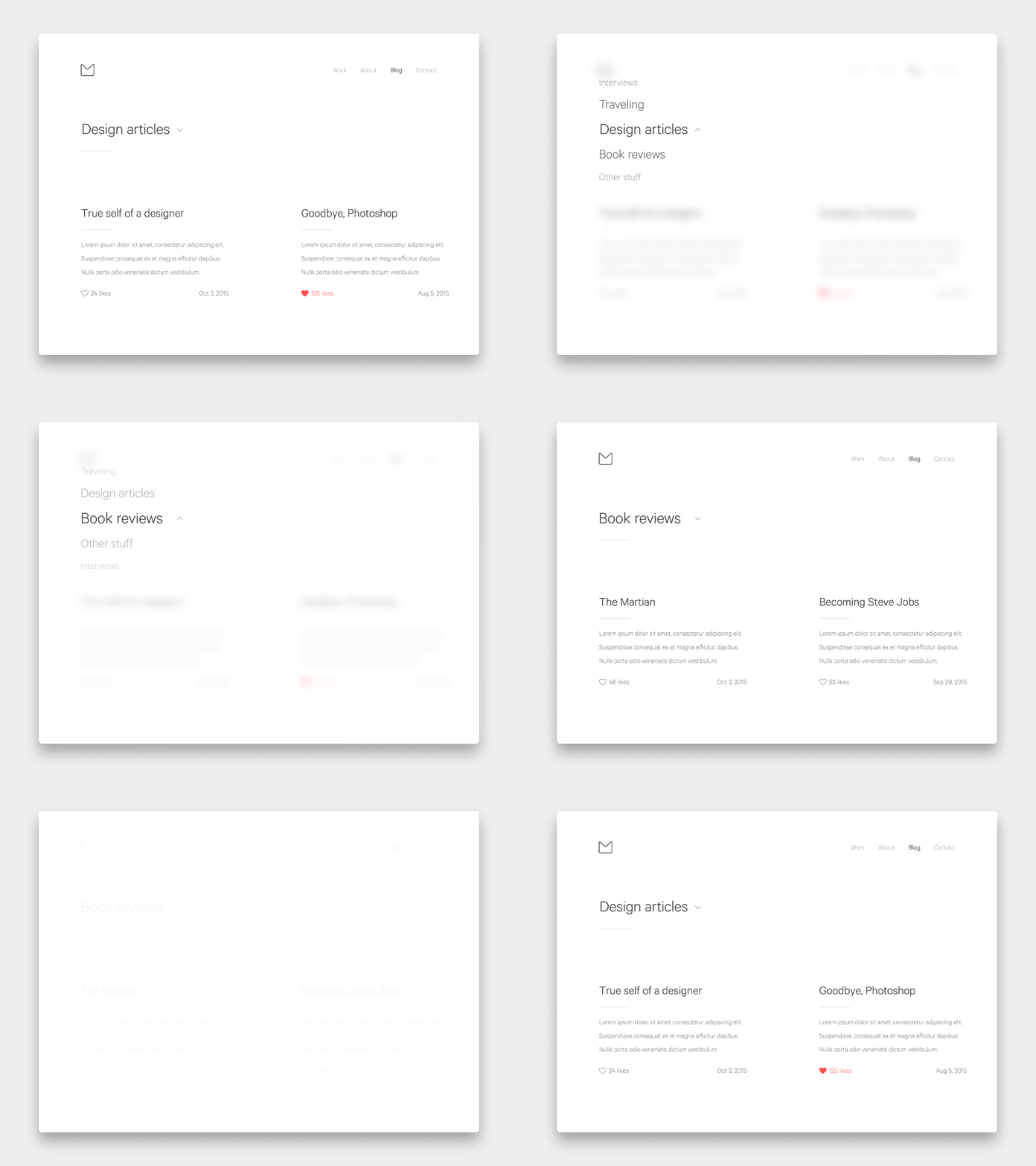
BLOG

- Organize the information clearly. Add categories like “latest” or “most popular” to guide your user.
- Include several CTAs, which allow your visitor to subscribe to your blog or download material of interest.
CONTACT PAGE

- Put relevant data, such as your address, a phone number and your email.
- Use a CTA. This allows your user to contact you easily.
In short, to optimize your website and improve your ranking on Google, you need to review the most visited pages, discover why users visit them, give them what they want and ask them to do something in return. You can also do some benchmarking; never downplay what you can learn from the competition. In this way you can generate stronger relationships with your followers and potential buyers.
Are you ready to take your business website to another level? At Color Squared, we focus on making websites ready to sell. ¡Talk to a specialist here!


